Welcome to the 50th edition of Conversations@tangible. It’s difficult to imagine we would have reached this milestone when we started but I’m proud we have.
In keeping with our 2024 theme of ‘craft and perseverance’, I would like to celebrate our 50th edition with 50 logos over the past 50 years.
For each of the last 5 decades, I’ve selected 10 logos that, in some small way, meant something in the context of that decade and made me think “I wish I did that!”.
Thank you to the decision-makers and creative minds (and hands) that have given the world something beautiful, bold or different to believe in.
1970’s: Craft was key, logotypes and symbols were entirely drawn by hand.
Kodak 1971: Some logos don’t need to change. This 1971 version was resurrected in 2016. If you look hard enough you can nearly see the original ‘Eastman Kodak Company’.
Lego 1972: For a block-based business to have a soft logotype says a lot about the vision and imagination behind it. This is the logo everyone knows as Lego.
Sony 1973: If you like slab serifs, this sets the benchmark for its classic simplicity.
Led Zeppelin 1973: There are too many great band logos (Rolling Stone, Iron Maiden, Kiss, Queen, ABBA, Pearl Jam, The Who, The Clash, The Beatles, Buzzcocks) but for craft, Led Zeppelin takes it.
NASA 1975: Even though the ‘worm’ logo was retired in 1992, it’s the one people remember and it’s the granddaddy of squiggly logos.
Apple 1976: Brilliant name, brilliant logo, and there is no going back after the first byte – sorry, not sorry.
Sex Pistols: This logo says everything about 1976, and Jamie Reid’s ‘hostage’ lettering was genius.
I love NY 1977: A classic logo from a classic designer – Milton Glaser
Zildjian late 1970s: I always loved the cursive, slightly mystical script and when I discovered the Turkish heritage of the business, I simply loved it more.
Absolut Vodka 1979: I was surprised to discover this iconic brand identity was developed in 1979 as it went on to define spirit chic in the 80s and 90s.
1980’s: Print technology was maturing but creativity was still largely expressed through drawing.
Stussy (early 80s): Created in the early 1980s by Shawn Stussy, the founder of the streetwear brand (and surfboard shaper). It defined a lasting graffiti spirit.
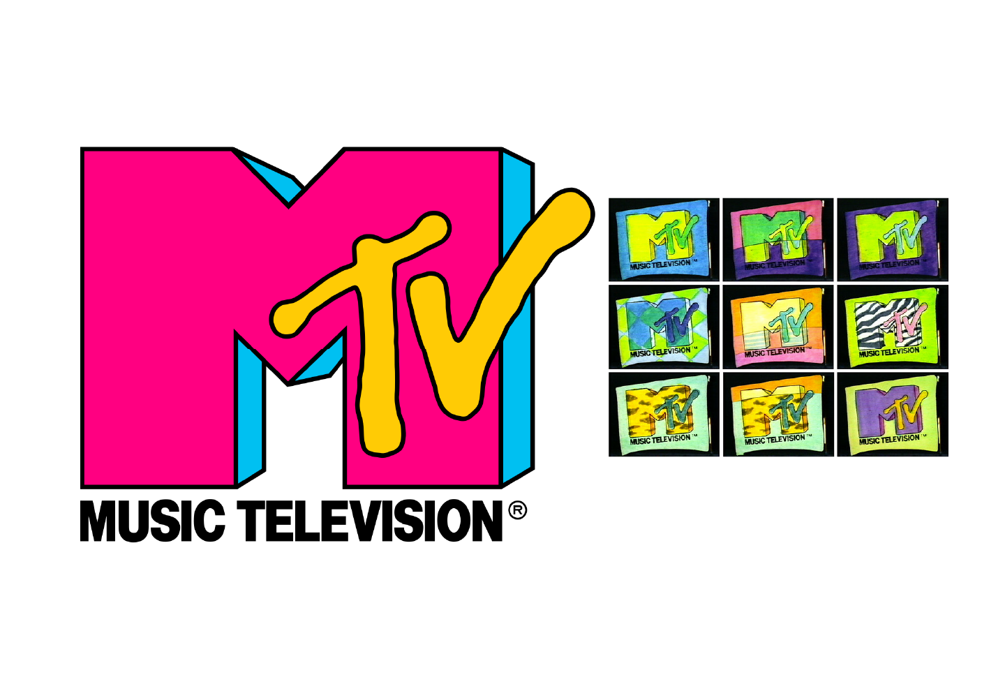
MTV 1981: This appeared to be the first logo that opened the idea of consistency through flexibility.
Channel 4 1982: For decades there were only three channels in the UK, so when the channel 4 logo came along, you knew the content was going to be different.
La Caixa 1982: What a brilliant idea for a Basque Bank to leverage Juan Miro – just brilliant!
Espana 1982: Twice in one year for Juan Miro – that’s just greedy.
Jones 1985: Seeing the carrier bags around Covent Garden was everything about cool.
WWF 1986: WWF had been using a panda since 1961 but the 1986 design by Jenny Leibundgut at Landor is considered one of the best logos of all time – I agree.
Air Jordan 1988: Under the design direction of Tinker Hatfield. This is arguably the silhouette that made Nike.
First Direct Launched in 1989 by HSBC. first direct promised simplicity through a beautifully understated name and logo.
V&A Museum 1989: Alan Fletcher crafted this piece of elegance.
1990’s: The decade that allowed personal computers to open everything up. This was the decade where technology unleashed creative hands
The Pixies 1991: Vaughan Oliver was a cult hero and everything he did was full of an ethereal craft that came from another world.
BT 1991: The BT piper heralded in a new wave of figurative logos.
The National Lottery 1994: It’s everyone’s logo
Orange 1994: ‘The future’s bright, the future’s orange’. So ambiguous, so clever. Now that was a teaser campaign.
FedEx 1994: from abbreviating the name to FedEx, to the iconic logo, just brilliant. Lindon Leader who was a senior design director at Landor Associates is attributed to this piece of genius.
RAC 1997: It seemed like the first in a futuristic genre of logotypes – it copied nothing – sorry Jaguar
National Geographic 1997: Who knew that a simple rectangular yellow frame could travel so far?
BBC 1997: it’s … definitive words and pictures in a logo.
Pathe 1999: Irreverently French – love it!
100% Pure New Zealand 1999: I was working in Wellington at the time, and this logo was just awesome aye.
2000’s: A brave new world of platforms and tools.
Dopod 2003: The definitive ‘round lettered logo’. not immediately obvious but so cool for one of the first convergent mobile / PDA devices.
Uniquely Singapore 2004: A beautifully crafted destination logo that reflects the sophistication of its multicultural blend.
Rapha 2004 another era-defining logo, that made MAMILs smarten up!
Unilever 2004: Paul Polman’s dream in a symbol that ‘adds vitality to life’.
Tiger Beer 2005: A beautiful illustration from Chris Mitchell for Design Bridge.
Aboitiz 2006: An entrepreneurial conglomerate, whose logo illustrates there are always alternatives.
Visit Australia 2006(ish). Captures the earthy spirit of a nation.
Globe Telecom 2007: There are lots of Telecoms Globes but this is the best Globe Telecom.
Jin Air 2008: The budget airline from Korean Airlines has the fuselage of a butterfly beautifully crafted into the negative space.
Dulux 2009: The ‘Let’s colour’ logo, tagline and activation campaign was a step change for Dulux.
2010 to present: As creativity became commoditized, gems are still everywhere.
Instagram 2011: Didn’t we all love the original? And, it’s great when a co-founder designs the logo. It’s a shame that it got dumbed down again and again.
San Diego Zoo 2010: Makes me want to visit the zoo just because of the logo.
Pinterest 2011: Such a great name that translates in a lovely ‘Favicon’ and logotype – another regrettable move to a simpler typeface.
Owl Coffee 2011: Can you see the coffee bean? A beautifully updated heritage brand that drove a dramatic shift in sales.
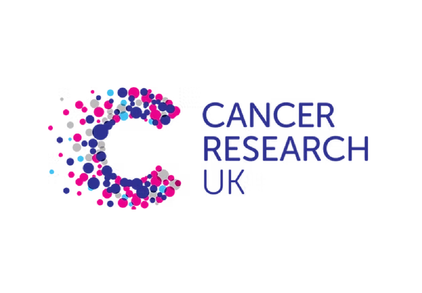
Cancer Research UK 2012: Interbrand designed this original logo. It confidently captures the collective struggle.
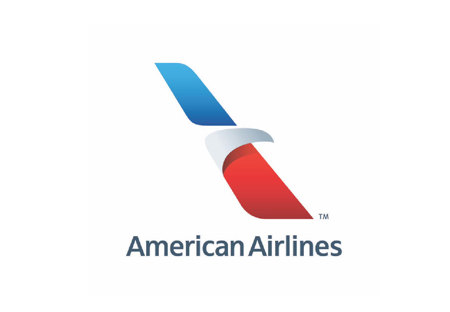
American Airlines 2013: Redesigning an Icon is tough, but the designer crafted a beautiful solution for American Airlines.
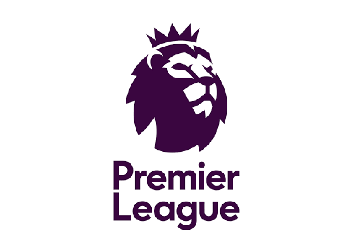
Premier League 2016: One of the best interpretations of the big cat and superbly implemented.
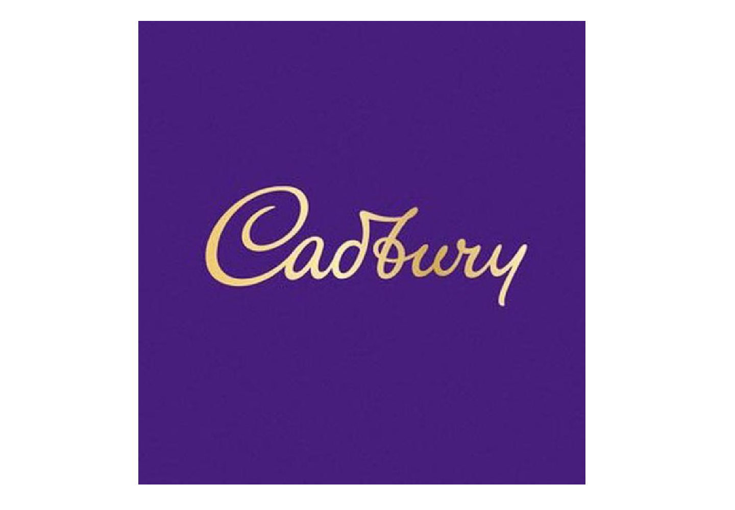
Cadburys 2020: I always loved the Cadburys logo and was pleasantly surprised to see such an elegant historic evolution.
F1 2017: Wieden+Kennedy designed the new ‘F1’ logo. It’s great to see an iconic logo get even more iconic.
Kia 2021: Appropriate to finish on one of my favourites. I love the craft in every letter – it completely changed my view of the brand and looks great on every vehicle.
I hope you’ve enjoyed this stroll through logo memory lane and I hope they illustrate that craft is alive and kicking.


